for coaches
Why My Website Gets No Clients (And What Fixes It)
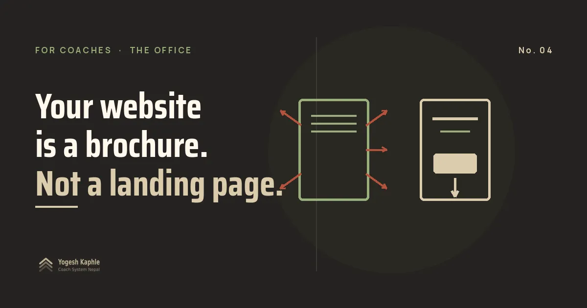
TL;DR: If you are wondering why my website gets no clients, the answer is usually that you built a brochure and expected it to close. A website and a landing page do two different jobs. A website builds slow credibility for people who already know your name. A landing page takes one stranger who just clicked and turns them into a contact. Most coaches paid for the first, never built the second, and then blamed the design.
A coach I know spent 30,000 rupees on a professional website last year.
Home page. About page. Services page. Gallery. Testimonials. Contact form. A blog section he never wrote a word in.
It looked clean. He was proud of it. He put the link in his Instagram bio, boosted a few posts, and waited.
Six months. Zero inquiries.
His diagnosis: “Website राम्रो छैन होला। Redesign गर्नु पर्ला।”
His actual problem: he built half of what he needed. The website was fine. The landing page did not exist. And nobody had told him those were two different things.
Why does my website get no clients?
Your website gets no clients because it was never built to get clients. It was built to describe you.
A website is your whole gym. Reception, changing room, cafe, the price board on the wall. Someone walks in, looks around, maybe picks up a flyer, maybe leaves. Ten things to do. Ten doors out.
A landing page is a consultation room. One chair. One conversation. They say yes to the next step, or they leave. Nothing else in the room.
Both have a job. Your website builds slow credibility. It works when someone searches your name, when an old client sends a friend your way, when a stranger wants to check you are real before trusting you.
Your landing page does one job only. It turns a stranger who just clicked into a name on your contact list.
Most coaches in Nepal have the first. Almost none have built the second. That is the whole reason the website sits quiet.
This is the office, step 2 of the 5-step system I use to get coaching clients online. You meet people on the street. You close them in the office. If your office is a brochure, nothing closes.
One action: open your site and count the clickable links on your homepage. Menu, socials, footer, everything. Write the number down.
What is the difference between a website and a landing page?
A website gives a visitor many choices. A landing page gives them one. That is the entire difference, and it changes everything downstream.
The gap is measurable. Unbounce analyzed 464 million visits across 41,000 landing pages and found a median conversion rate of 6.6% (Unbounce Conversion Benchmark Report). Dedicated pages built for one action. Not homepages. Not services pages. Pages with one job.
Your homepage is not converting anywhere near that, and it never will, because every extra link is another way to leave.
A working landing page also does not try to sell coaching. Most coaches build what they call a landing page and it is really a smaller services page. Pricing. Packages. Three testimonials. “DM to join.”
That is a brochure with fewer pages.
A working landing page sells the next step, not the final purchase. The next step is small. A free consultation. A free PDF. A short video. Something a stranger can say yes to without opening their wallet. This is where the trade that earns you a contact actually happens.
One specific person arrives. They see one problem that feels like theirs. One small action sits in front of them. They take it, or they do not. Nothing else happens on that page.
The 3 mistakes coaches make on their landing page
Mistake 1: it is a homepage in disguise.
Top menu with five links. Footer stuffed with social icons. A pricing table in the middle. Three competing buttons: Book Now, Learn More, Contact Us.
Every extra link is a door out. Every door out is a client walking through it.
No navigation. No footer. No exits. One scroll, one decision.
Mistake 2: the offer is vague.
“DM me for online coaching.” “Get fit with custom plans.” “Transform your body.”
None of these tell a real person what actually happens next. Does it cost money? What arrives after they click? What exactly are they agreeing to?
Specific enough that they can picture the next five minutes. That is the bar.
Mistake 3: no reason to act now.
Everyone who thinks “I’ll come back to this later” is gone. I have never once seen one come back.
Your page needs one small action they can complete right now. Thirty seconds. Not after they discuss it with their wife. Not when they have more time.
If thirty seconds is too much to ask for, the page is not ready.
What actually goes on a landing page
Five things. That is all.
| Element | What it does |
|---|---|
| One headline | Says who it is for and what they get. Not your tagline. Not your bio. |
| One sub-line | Explains what happens next: what they receive, how long it takes, what they give |
| One CTA | A single button or form. Not three options. One. |
| Nothing to wander to | No menu, no footer, no social icons, no exits |
| One piece of proof | One real number, one real result, one honest line from someone you helped |
Build this on a single page. Two hours, maybe less. No designer. No 30,000 rupees. No waiting until everything feels ready.
The page is the thing that makes you ready.
One action: write the five elements on paper before you touch any builder. If you cannot fill them, the page is not the problem yet. The offer is.
What should the offer on the page actually be?
Not your paid program. The strongest offer for a coach in Nepal is a small free thing that earns the right to a real conversation before money is mentioned.
A free consultation. A short video. A checklist that fixes one specific problem this week.
That free thing has a name. It is called a lead magnet, and the difference between one that converts and one that gets ignored is bigger than most coaches expect. It is also the first rung of your offer ladder, which is why followers who like everything still buy nothing until you give them a cheap first yes.
Give them something small to say yes to. The big yes comes later, and it comes easier.
One thing to do this week
Go back to that number you wrote down. Every clickable link on your homepage.
More than three? That is a brochure. Not a landing page. Not the same job, and no amount of redesign will change that.
So you have two options. Build a separate landing page, or accept that the site will not bring clients in. There is no third option where the brochure suddenly starts closing.
Pick one.
If you want to see what a working landing page looks like in practice, mine is live at start.yogeshkaphle.com. One offer. One decision. Nothing else on the page.
Key Takeaways
- Your website gets no clients because it is a brochure. A brochure describes you. A landing page captures a decision.
- A website gives visitors many choices. A landing page gives them one. That is the whole difference.
- Dedicated landing pages convert at a median of 6.6%. Your homepage, with its menu and footer and five exits, does not come close.
- The three killers: a homepage in disguise, a vague offer, and no reason to act in the next thirty seconds.
- The offer on the page should never be your paid coaching. It should be a small free thing that earns the right to the next conversation.
How many clickable links did you count on your homepage? Drop the number in the comments. I read every one.